Sponsors


Introduction to Data Visualization with Matplotlib
Nowadays data science is being used everywhere, and demand for data scientists is increasing every day. But data is worthless if it cannot tell you a story visually. Matplotlib is a great library that can make your data talk and tell stories visually. The name matplotlib came from Matlab. Matlab had various restrictions working with visualizations. Writing programs with it is also not that fun. A man named John D. Hunter was also facing various problems working with it. So, he decided to create a different plotting tool that would use a rich programming language and that would also be open source, unlike Matlab. That resulted into the Python library called Matplotlib.
In this article I will teach you how to get started with data visualization using matplotlib. Without further ado let's get started.
Prerequisite
This is not a beginner level article on Python programming. So, it is expected that you check the following list.
- You should have basic and intermediate knowledge in Python programming.
- You should have prior knowledge working with Jupyter Notebook.
- You should be comfortable working with Python's pip (a command line tool).
Preparing the Environment
We are going to work with Jupyter Notebook. So, you should have Jupyter Notebook installed on your system. If you do not have Jupyter Notebook installed then see the instruction on the official website on how to install and use it. We will need to install Matplotlib with the following command:
pip3 install matplotlibIt will install other dependencies as well, e.g. numpy.
Choose or create a directory where you want to start your notebooks (.ipynb files). Open the command line in this directory. Run the following command:
jupyter-notebookAfter bootstrapping it will start the default web browser on your system. Create a new Python 3 notebook from there. The default notebook name will be Untitled, you can change it to whatever name you like.
Notebook Setup and Imports
When we plot data with the help of Matplotlib, we want to see the data on the browser window (just below the code blocks). To do so we need to call a magic function so that Jupyter Notebook understands our intention. We need to use the following magic function:
%matplotlib inlineWe are asking Jupyter to show the graphics produced by matplotlib inline.
Matplotlib has various ways of doing the same task. In this introductory lesson, we will use pyplot sub module from matplotlib. So, let's import that with the following import line:
from matplotlib import pyplotWe will also need numpy in future lessons and you can then import that with:
import numpySo, for this lesson, our initial code on Jupyter notebook should look like the following:
%matplotlib inline
from matplotlib import pyplot
Creating a Simple Line Graph
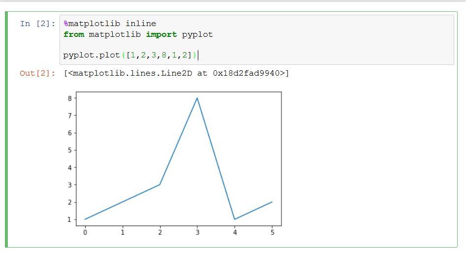
The simplest of all graphs is line graph. To create a line graph you can use the plot() function from pyplot. You can provide it with a list of numbers to see how it works.
%matplotlib inline
from matplotlib import pyplot

pyplot.plot([1,2,3,8,1,2])
It will look like the following image:
Tuning Our Line Graph
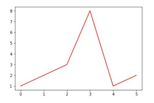
Things in matplotlib can easily be customized. The style of our graph we saw on the above image is provided by matplotlib. We can tune its colors, edges, styles, etc.
Let's change the line color to red. To do this we have to pass a keyword argument to the plot() function called color:
pyplot.plot([1,2,3,8,1,2], color="red")The image will look like below:
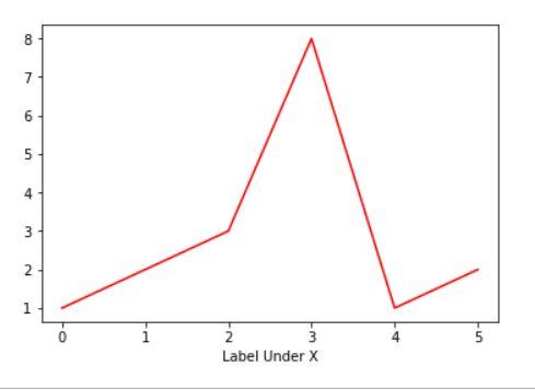
We do not have any labels beside or below our graph. If you want to provide some label under the X axis you can call xlable() with a string to attach the label.
pyplot.plot([1,2,3,8,1,2], color="red")
pyplot.xlabel("Label Under X")
Look at your notebook to see the change that will look like this:
In our example we only provided the points on the Y axis with the help of that array. When you provide only one array (pure python array or numpy array), the plot() function will assume it to be points on Y axis. If you provide two arrays then it will assume the first one as points on X and the second as points on Y. Let's do that.
pyplot.plot([0,1,0,1,2,3], [1,2,3,8,1,2], color="blue")
pyplot.xlabel("Label Under X")
Look at the following image:
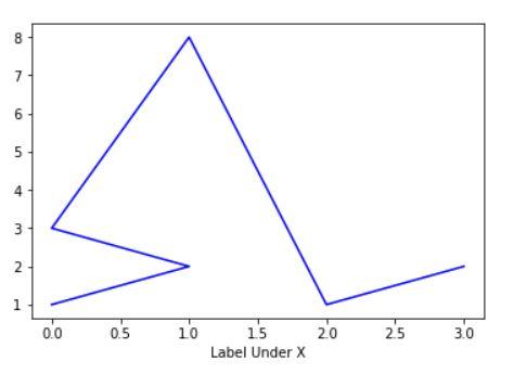
Ah! That's a terrible line graph.
Sometimes, you may not want to see the originating X and Y axis. To do so you can call axis() function passing "off" to it.
pyplot.axis("off")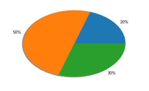
Creating a Simple Pie Chart
Pie charts are very versatile. They are also very easy to create with matplotlib. You need to use the pie() function from pypolot to do so. As the first parameter you have to pass an array of numbers that will represent a portion on the pie. Use numbers such that if they are converted to percentage they add up to 100%. For example, an array of 10, 70, 20 will add up to 100 and if they are converted to percentage they will also add up to 100%. If you do not go by the rule then you may see unpredictable behavior.
%matplotlib inline
from matplotlib import pyplot

pyplot.pie([2, 5, 3], labels=["20%", "50%", "30%"], shadow=True)
Conclusion
Data is incomplete without visualization. They are two sides of the same coin. In this article we have seen just the basic uses of matplotlib as this is the first article on the series of data visualization with Matplotlib. In future articles we will explore in more depth data visualization with Matplotlib. You are advised to try out different examples, experiment with your own input by using your knowledge of math and statistics.
I will upload the code used here on my Github repository and I will also upload future updates and code in future posts there. Here is the link to my Github profile: SabujXi.
Recent Stories


Top DiscoverSDK Experts


Compare Products
Select up to three two products to compare by clicking on the compare icon () of each product.
{{compareToolModel.Error}}
{{CommentsModel.TotalCount}} Comments
Your Comment