Sponsors


Matplotlib Tutorial
Matplotlib Tutorial
Important Note: This tutorial has written at Spyder environment. (It's very comfortable, user friendly environment. therefore, it's highly recommended). As a result, there are some commands that occur automatically in this environment, and should be operated manually in other environments. I will emphasize some of them later on.
At First we would like to import the Matplotlib library in Ipython as follows:
Note that we also need to import the Numpy library for define arrays and vectors and the Math library to perform mathematical operations.
In [1]: import numpy as np
In [2]: import matplotlib.pyplot as plt
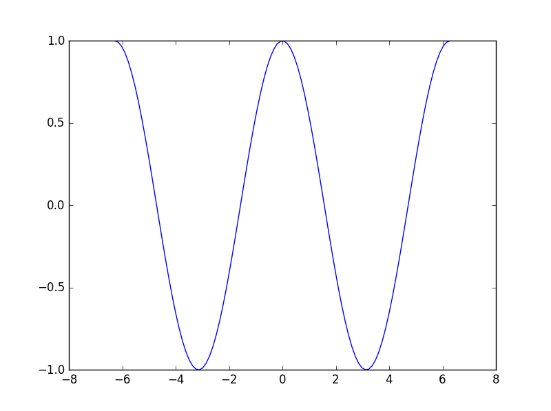
In [3]: import mathWe will draw a graph of the cos function at Section (-2π, 2π )
In [4]: math.pi
Out[138]: 3.141592653589793

In [5]: x = np.linspace(-2*math.pi , 2*math.pi, 100)

In [6]: y = np.cos(x)

In [7]: plt.plot(x, y)
Out[7]: [<matplotlib.lines.Line2D at 0x18e78048>]
Notice thet the graphs display occurs inside the shell only because we work with the Spyder environment. In other environments we should use the magic function %matplotlib inline to do so. And in function plt.show() for creating the plot window which open automatically at spyder.
Now we want to perform some operations on graphs as follows:
First lets reopen the plot window by the command:
In [8]: plt.plot(x, y)
Out[8]: [<matplotlib.lines.Line2D at 0xb530f28>]
Now lets perform several actions on the plot:
lets use the following magic command. It will open a separate window of the plot. Now we can activate the plot functions easily and effectively.
In [9]: %matplotlib
Using matplotlib backend: Qt4Agg
All the actions will take place while the plot window is still open. after each command the plot will be updated accordingly
In [10]: plt.title('Cosine plot',fontsize=18, color='y')
Out[10]: <matplotlib.text.Text at 0x1b4cc588>

In [11]: plt.ylabel('Y label',fontsize=12, color='g')
Out[11]: <matplotlib.text.Text at 0x1b428588>

In [12]: plt.xlabel('X label',fontsize=12, color='r')
Out[12]: <matplotlib.text.Text at 0x1b212898>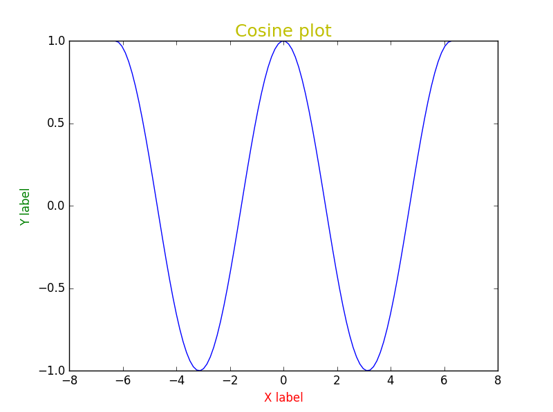
We can get more information about the choosing color possibility by:
In [20]: plt.colors? ===== =======
Alias Color
===== =======
'b' blue
'g' green
'r' red
'c' cyan
'm' magenta
'y' yellow
'k' black
'w' white
===== =======
Now we will want to get the plots of more than one function on the same chart:
In [13]:x = np.linspace(0, 10, 11)

In [13]:y = np.linspace(0, 10, 11)

In [14]:plt.plot(x, y)
plt.plot(2*x, y)

Out[14]: [<matplotlib.lines.Line2D at 0xc099d68>]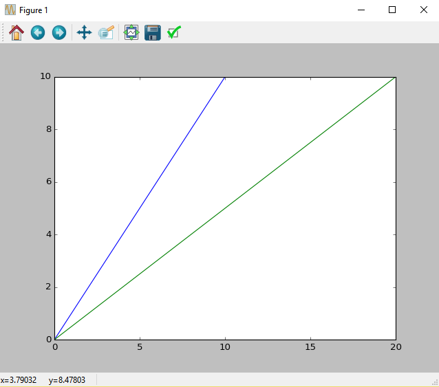
We can also display the plots in two separate windows with the function plt.figure():
In [15]:x = np.linspace(0, 10, 11)

In [16]:y = np.linspace(0, 10, 11)

In [17]:plt.plot(x, y)
        plt.figure()
        plt.plot(2*x, y)

Out[17]: [<matplotlib.lines.Line2D at 0xccedbe0>]
We can create others marking graphs as follows:
In [18]: plt.plot(x, y, 'r^-')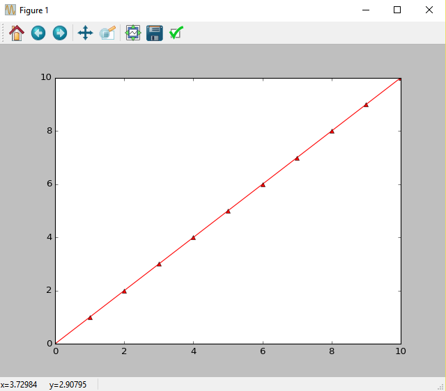
The letter "r" describes the color curve. The Sign "^" describes the marking. Pay attention to what happens when skip the marking "-".:
Note that the order of the marks in the string does not matter.
In [35]: plt.plot(x, y, '^r')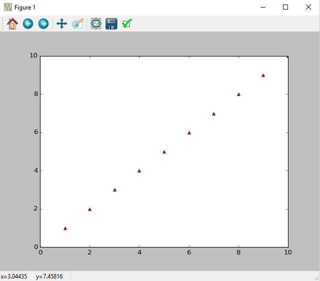
Now we'll create a number of curves at the same graph with simple command:
We used " 'k-.' " for displaying the curve with the following shap: "_ . _"
In [36]: plt.plot(x, np.sin(y), 'g^--', x, y, 'r*-', x,np.cos(y), 'k-.')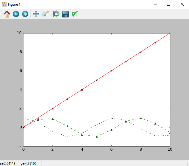
You can also design the marks themselves by the following shortcuts:
mec - the color of the marker perimeter
mfc - fill color of the marker
lw - line thickness of the curve
ms - The size of the marker
mew - the perimeter thickness of the of the marker
For additional design options, type the following command:
In [36]: plt.plot?
For example:
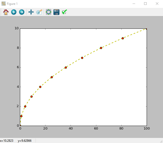
In [37]: plt.plot(x**2, y, 'yo--',mec='green', mfc='red', mew=1,lw=2,ms=7)
Out[37]: [<matplotlib.lines.Line2D at 0xca5e128>]
Setting a Legend:
In [38]: plt.plot(x, x**2, 'g^--', x, 8*np.sin(x), 'ro')
         plt.legend(['x^2', '8*sin(x)'], loc='upper right')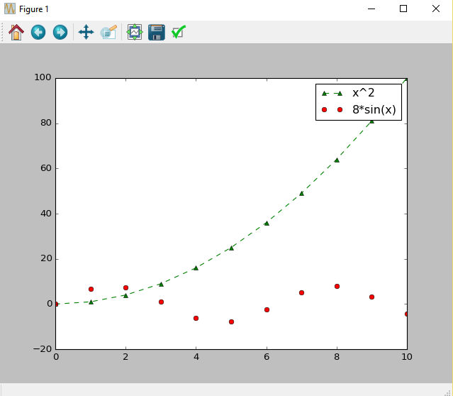
The simplest way to define some curves in one graph.( the colors selected arbitrarily):
In [69]: plt.plot(x, x*3, x, x*2, x, 5*x)
         plt.legend(['5*x', '3*x','2*x'])
Adding grid Lines to the graph:
In [70]:plt.plot(x, x*3, x, x*2, x, 5*x)
        plt.legend(['5*x', '3*x','2*x'])
        plt.grid()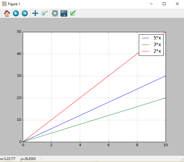
Recent Stories


Top DiscoverSDK Experts


Featured Products


Compare Products
Select up to three two products to compare by clicking on the compare icon () of each product.
{{compareToolModel.Error}}
{{CommentsModel.TotalCount}} Comments
Your Comment