React Native Components Layouts
In the previous lesson, we saw how to style React components with Inline styles and how to make separate stylesheet documents with modular design and folder structure. In this lesson, we will cover layouts in React Native.
One of the biggest changes when working with styling in React Native is positioning. CSS supports a lot of positioning techniques. Between float, absolute positioning, tables, block layout, and more, it’s easy to get lost! React Native’s approach to positioning is more focused, relying primarily on flexbox as well as absolute positioning, along with the familiar properties of margin and padding. In this lesson, we’ll look at how layouts are constructed in React Native, and finish off by building a layout in the style of a Mondrian painting.
Flexbox Layouts
With React Native, the following flexbox props are available:
- flex
- flexDirection
- flexWrap
- alignSelf
- alignItems
Additionally, these related values impact layout:
- height
- width
- margin
- border
- padding
We’ll start with a parent <View>, and some children:
<View style={styles.parent}>
 <Text style={styles.child}> Child One </Text>
 <Text style={styles.child}> Child Two </Text>
 <Text style={styles.child}> Child Three </Text>
</View>
To start, we’ve applied some basic styles to the views, but haven’t touched the positioning yet:
var styles = StyleSheet.create({
 parent: {
   backgroundColor: '#F5FCFF',
   borderColor: '#0099AA',
   borderWidth: 5,
   marginTop: 30
 },
 child: {
   borderColor: '#AA0099',
   borderWidth: 2,
   textAlign: 'center',
   fontSize: 24,
 }
});
Let’s look at how this renders up:
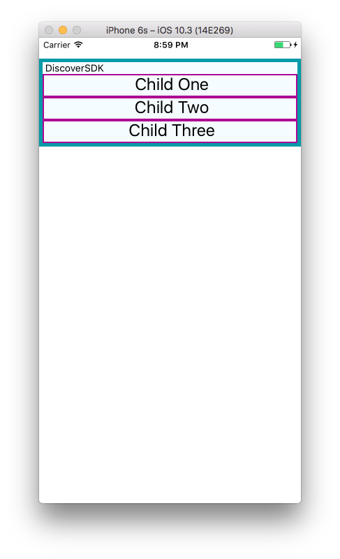
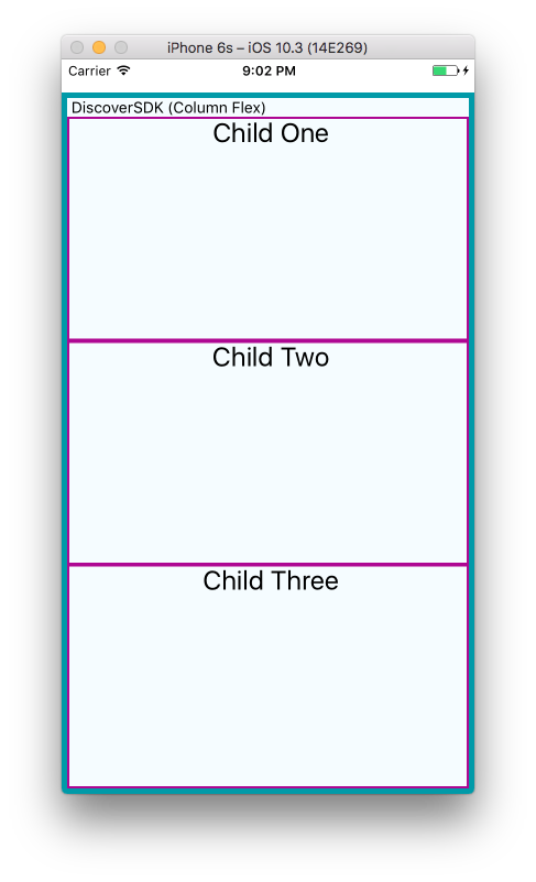
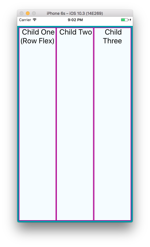
Next, we will set flex on both the parent and the child. By setting the flex property, we are explicitly opting in to flexbox behavior. Flex takes a number and this number determines the relative weight each child gets; by setting it to 1 for each child, we weigh them equally.
We also set flexDirection: 'column' so that the children are laid out vertically. If we switch this to flexDirection: 'row', the children will be laid out horizontally instead.
This is the style component:
var styles = StyleSheet.create({
 parent: {
   flex: 1,
   flexDirection: 'column',
   backgroundColor: '#F5FCFF',
   borderColor: '#0099AA',
   borderWidth: 5,
   marginTop: 30
 },
 child: {
   flex: 1,
   borderColor: '#AA0099',
   borderWidth: 2,
   textAlign: 'center',
   fontSize: 24,
 }
});
Let’s see how these 2 experiments render on iOs simulator:
|
Column Flex |
Row Flex |
 |
 |
If we set alignItems, the children will no longer expand to fill all available space in both directions. Because we have set flexDirection: 'row', they will expand to fill the row. However, now they will only take up as much vertical space as they need.
Then, the alignItems value determines where they are positioned along the cross-axis. The cross-axis is the axis orthogonal to the flexDirection. In this case, the cross axis is vertical. flex-start places the children at the top, center centers them, and flex-end places them at the bottom.
Let’s see what happens when we set alignItems :
var styles = StyleSheet.create({
 parent: {
   flex: 1,
   flexDirection: 'row',
   alignItems: 'flex-start',
   backgroundColor: '#F5FCFF',
   borderColor: '#0099AA',
   borderWidth: 5,
   marginTop: 30
 },
 child: {
   flex: 1,
   borderColor: '#AA0099',
   borderWidth: 2,
   textAlign: 'center',
   fontSize: 24,
 }
});
Using Absolute Positioning
In addition to flexbox, React Native supports absolute positioning. It works much as it does on the Web. You can enable it by setting the position property:
position: absolute
Then, you can control the component’s positioning with the familiar properties of left, right, top, and bottom.
An absolutely positioned child will apply these coordinates relative to its parent’s position, so you can lay out a parent element using flexbox and then use absolute position for a child within it.
There are some limitations to this. We don’t have z-index, for instance, so layering views on top of each other is a bit complicated. The last view in a stack typically takes precedence.
Absolute positioning can be very useful. For instance, if you want to create a container view that sits below the phone’s status bar, absolute positioning makes this easy:
container: {
 position: 'absolute',
 top: 30,
 left: 0,
 right: 0,
 bottom: 0
}
Third-Party Libraries
React Native has a big community behind it, so it’s no wonder that a few libraries have already been created to ease the implementation of layouts. Here, we'll introduce you to a library called React Native Easy Grid. You can use it to describe how you want to lay out your app by making use of the Grid, Row, and Col components.
We can install it with the following command:
npm install react-native-easy-grid --save
Import the library and extract the different components in your file.
import React, { Component } from 'react';
import {
 StyleSheet,
 View
} from 'react-native';

import { Col, Row, Grid } from "react-native-easy-grid"
The Grid component is used for wrapping everything. Col is used to create a column, and Row is used to create rows. You can specify a size property for both Row and Col, though we only used it on the Row below. If the size isn't specified, it will equally divide the available space between the Col instances.
In this case, there are only two, so the whole screen is divided into two columns. The first column is then divided into two rows. Here we specified a size, but you can actually skip it if you just need equally sized rows, as we did below.
export default class FlexboxGridLibrary extends Component {

 render() {
   return (
       <Grid>
           <Col>
               <Row size={50} style={styles.orange_box}></Row>
               <Row size={50} style={styles.green_box}></Row>
           </Col>
           <Col style={styles.gray_box}></Col>
       </Grid>
   );
 }}
Once that's done, all you have to do is add the styling for the rows and columns:
const styles = StyleSheet.create({
 orange_box: {
   backgroundColor: 'orange'
 },
 green_box: {
   backgroundColor: 'green'
 },
 gray_box: {
   backgroundColor: 'gray'
 }
});
As you have noticed, React Native Easy Grid has a very intuitive API.
Summary
In this lesson, we looked at how styles work in React Native. While in many ways styling is similar to how CSS works on the Web, React Native introduces a different structure and approach to styling. There’s plenty of new material to digest here! At this point, you should be able to use styles effectively to create the mobile UIs you need with React Native. And best of all, experimenting with styles is easy: being able to hit “reload” in the simulator grants us a tight feedback loop. (It’s worth noting that with traditional mobile development, editing a style would typically require rebuilding your application. Yikes.)
If you want more practice with styles, try Github projects by Facebook with React Native, and adjusting their styling and layouts. As we build more sample applications in future lessons, you’ll have plenty of material to practice with too!
Recent Stories
Top DiscoverSDK Experts


Compare Products
Select up to three two products to compare by clicking on the compare icon () of each product.
{{compareToolModel.Error}}





{{CommentsModel.TotalCount}} Comments
Your Comment